MS Society of Canada
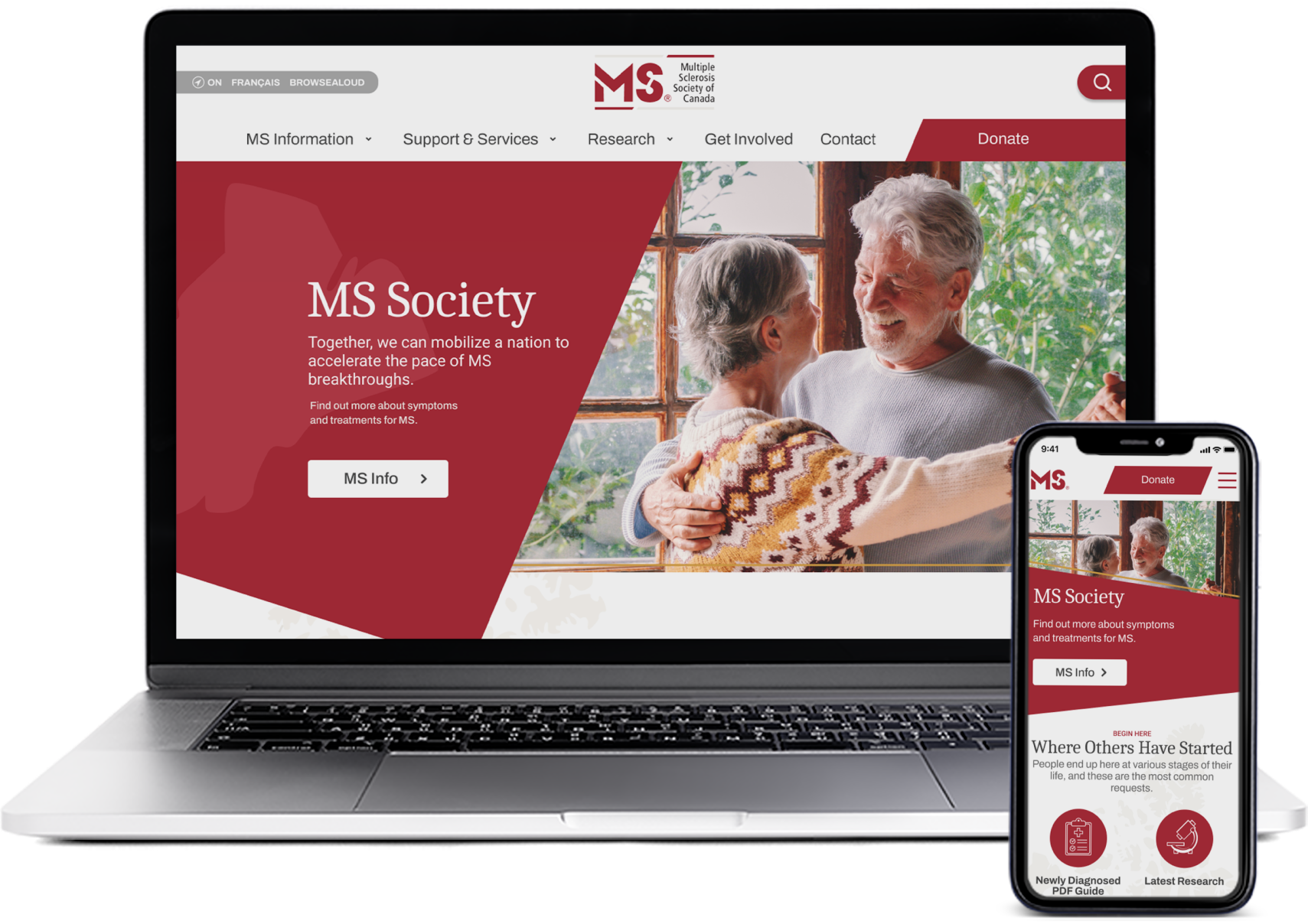
Users are having a hard time finding the information they need through the current navigational structure. By creating an experience with an emotional connection, users can leave the site comforted and informed on the next steps in their MS journey.
Role
Group Project: Product Designer - User Research, Brand Design, Prototyping and Testing
Scope
Responsive Website Re-design:
End to End UX Design - 5 Weeks
Design Process
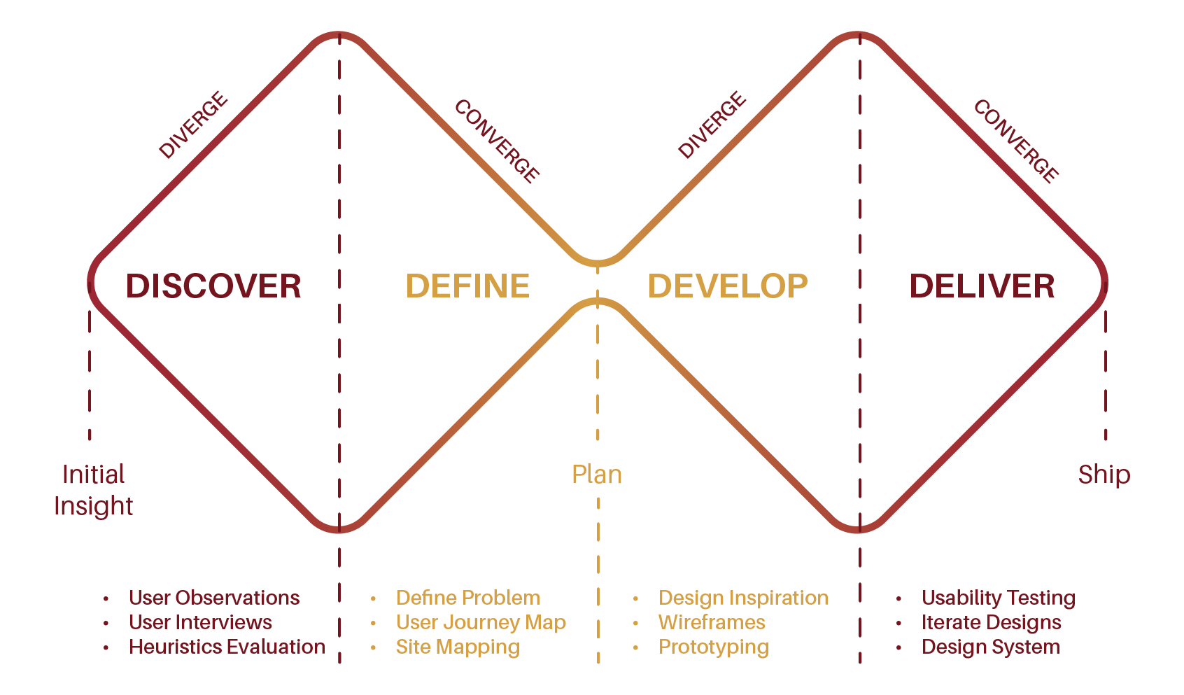
Discover:
Detection and Testing
The MS Society of Canada helps fund research behind Multiple Sclerosis to help find a cause and cure as well as providing resources and services to its network of over 7,000 members and their families, making it the only national voluntary organisation to support both Research and Services.
With over 90,000 Canadians living with Multiple Sclerosis and 12 Canadians diagnosed daily, the current MS Society of Canada’s website aims to be a leader of resources and support to help patients and their families navigate their diagnoses.
To be able to start the process of making the user’s experience on the MS Society’s website better we had to understand 3 things.

1. What works on the current site?
2. What does not work on the current site?
3. Most importantly, what is the main reason that the user comes to the site?
After our initial review of the site from our design eyes, we were able to identify many visual issues with the site but wanted to gather additional feedback as well so we chose to conduct user observations where we asked users to explore the site and share their initial reactions and feelings.

The assumption was made that gathering donations to further the research and studies into MS was the main goal of the site. We then took the opportunity to conduct some initial user interviews with our group of users to better understand how and why people donate to causes and their habits surrounding making donations.
This is when we took the critical step to contact the direct stakeholders at MS Society and get the real facts. Fortunately, I was able to connect with the Director of Marketing and was able to conduct an interview that provided us with the details that really changed our course.

Define:
Diagnosis
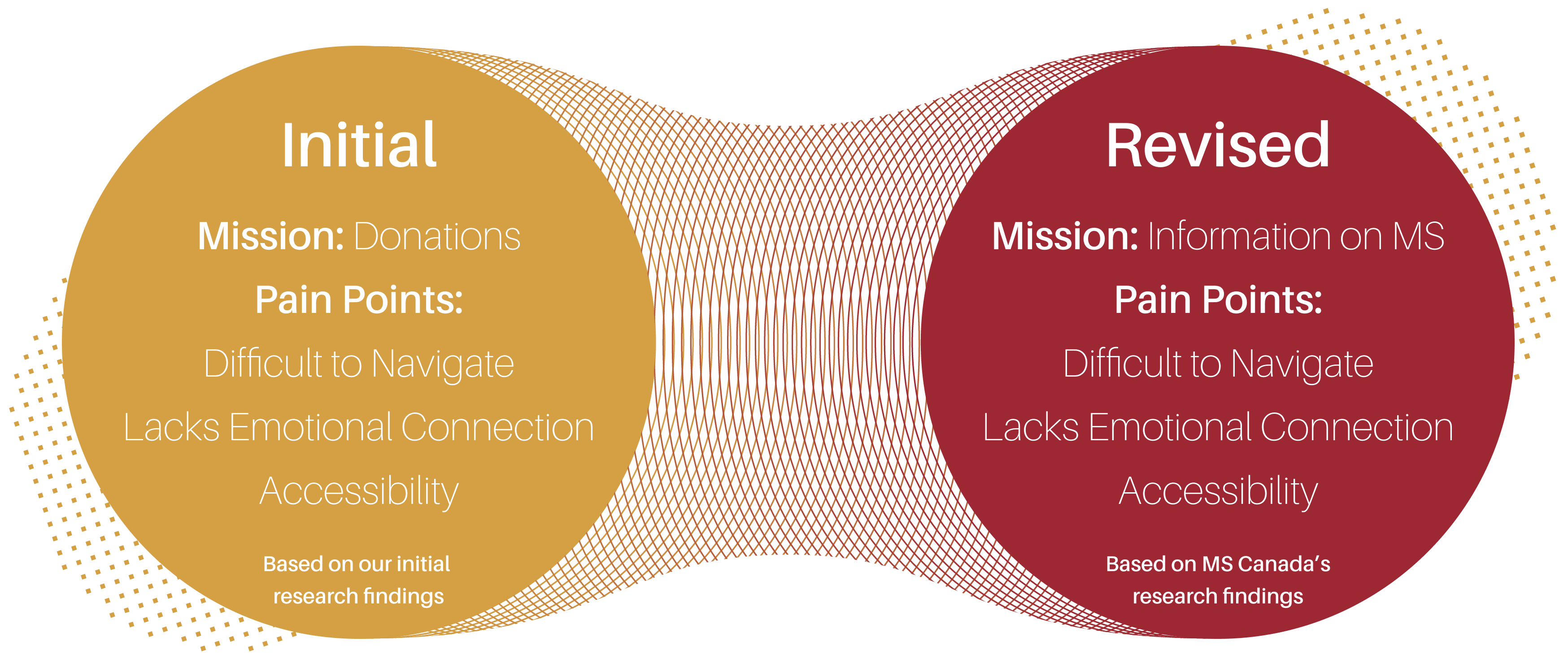
It was clear that we had misread the primary mission of the site and were asking the wrong questions when it came to solving the real problems. That being said, not all of our research had been in vain.
There were many similarities between our findings and those of the research conducted by the MS Society, but it came to light that the main reason user’s come to the site is to gather information for themselves or families based on a recent diagnosis.
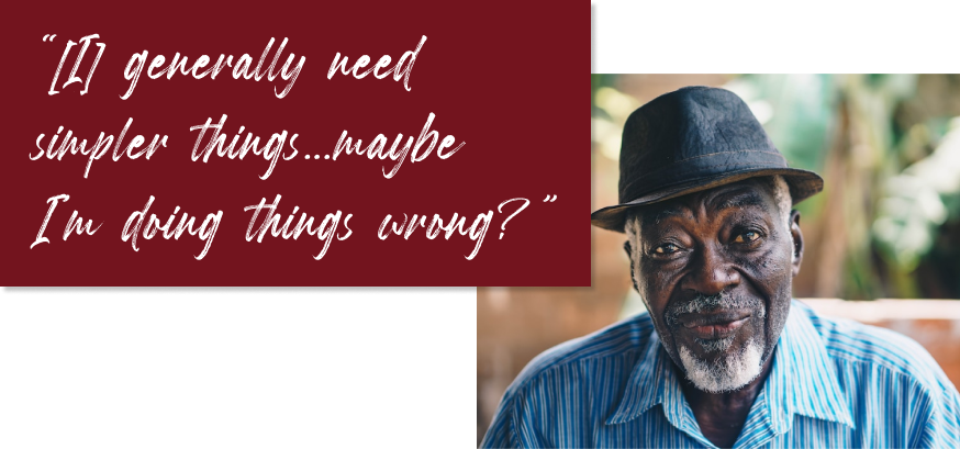
The issue users were having is that they had a hard time finding the information they needed through the current navigational structure and issues with design related to legibility of content due to font and colours as well as the lack of imagery supporting the information.

Our mission then became clear.
To create an experience for the user that guided them along a journey of first steps to get the information and support that they needed all while setting a tone that would make them feel understood and connected with others who were going through the same experience.
Develop:
Referral and Consultation
Our research led us to focus our efforts behind 3 main areas.
Navigational
Journey
Our initial idea was to create a clearer navigation menu that was less overwhelming and to include images in the menu to help give visual cues to the content.

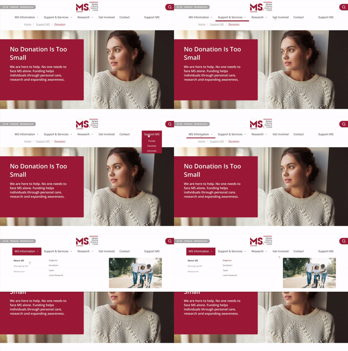

Taking the First Steps
After conducting usability testing in the initial menu navigation, we realised that because of the abundance of information and resources that the MS Society provides, this wasn’t the most effective way of connecting with the user.
It also came to light that some of the verbiage was confusing to users. The use of "Get Involved" and "Support MS" was providing unclear guidance for where users should go to make donations and/or volunteer.

Paving the Road
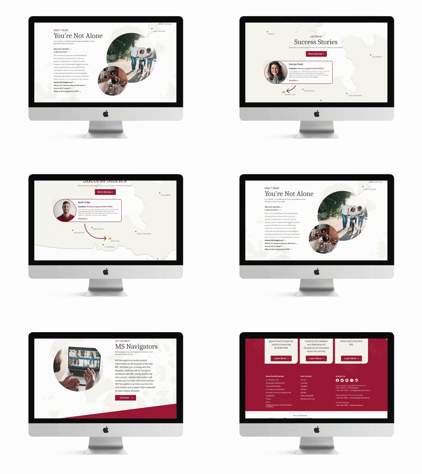
We then turned our attention to the home page. We focused on building out an experience that provided all of the most critical points of information as well as to highlight other people’s stories and showcase the support system of the MS Navigators (a 1-on-1 chat network) that would help users not feel alone.
Much like a doctor’s guidance, we focused on the initial steps that could be taken and then followed with the more long term areas of focus so as to not overwhelm the user.
Emotional Connection
When it came to creating an emotional connection, we tried to keep in mind that “a picture is worth a thousand words” but that words also do matter, and that using both hand in hand, can create the supportive embrace we required.
Let's Stay Connected
The homepage was laid on top of a map of Canada to further enhance the message of the journey with interactive elements to showcase people around us going through similar experiences, creating a further sense of community.
Users really connected with this element as it gave them the feeling that they truly weren't alone on this journey.
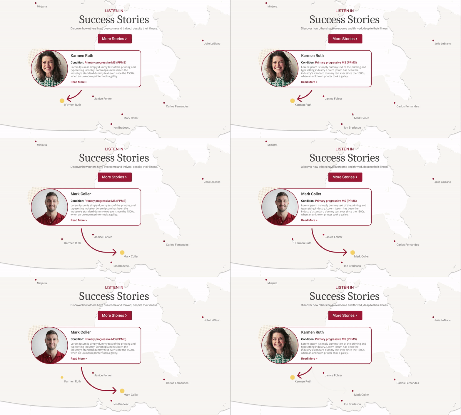
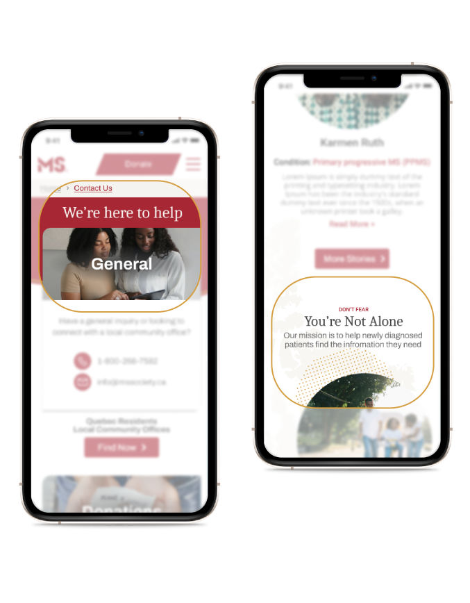

A Few Kind Words
Encouraging and supportive verbiage was used to help solidify the emotional connection behind the site and that there were real people on the other side waiting to help with every step of the way.

Accessibility
We knew that we needed to look at how to update the brand’s standards while creating a more accessible experience for those dealing with MS.

Our research led us to understand that vision impairment (blurred vision, dim vision, or loss of colour vision) and loss of dexterity (one of the major symptoms of MS) were factors we had to take into consideration when designing the components for the site. We needed to take an approach that would find the balance between maintaining the current brand voice while addressing these issues.
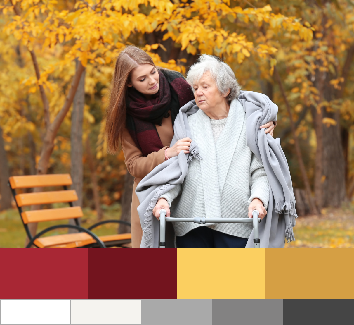
Our first focus was to modify the colour pallet to reduce the harshness of the colours while increasing the readability but making sure to choose colour pairings that had high WCAG contrast ratios.

Touching Base
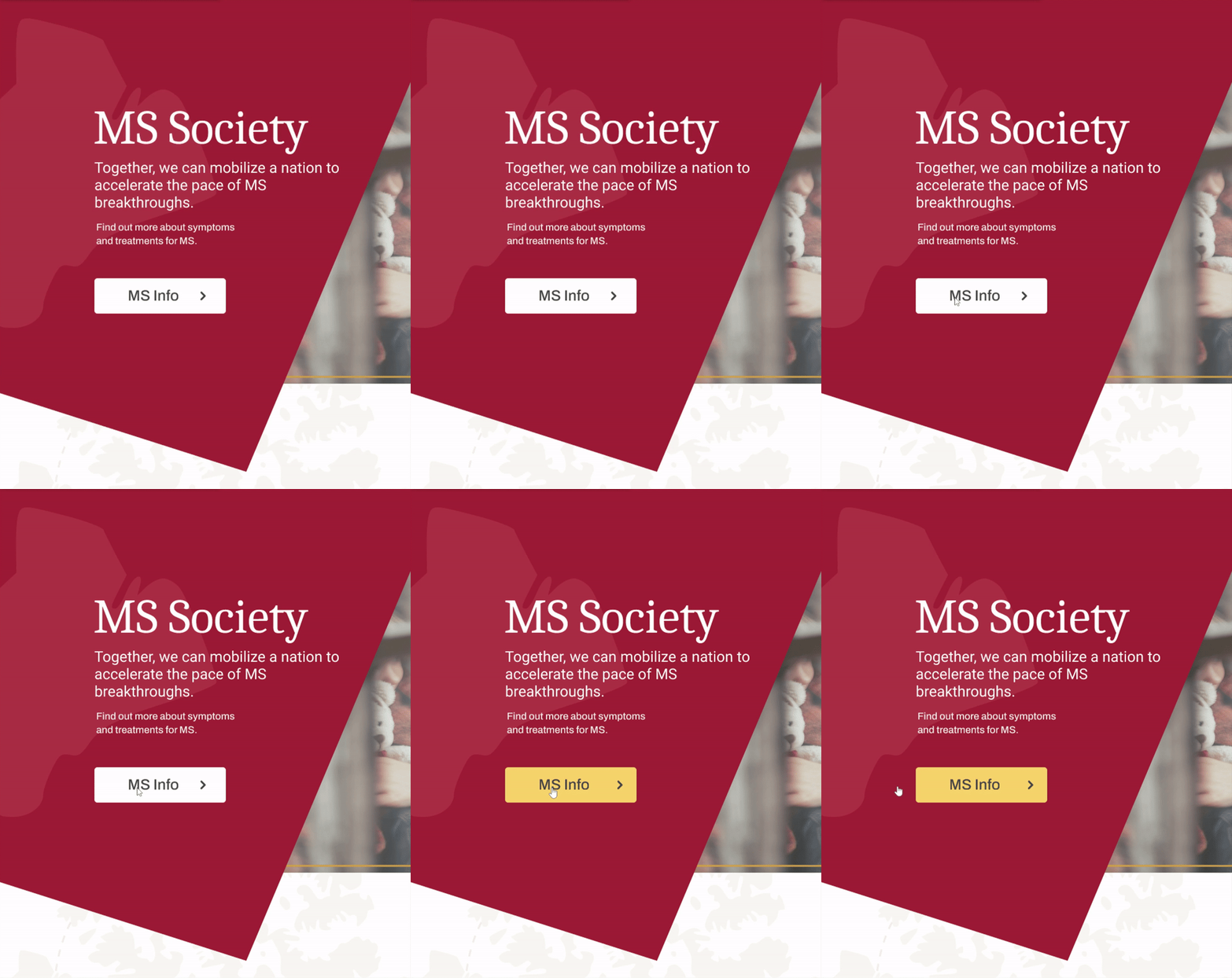
We also made sure to be very mindful that although interaction design usually delights users, we had to make sure to make any animation/movement on our site very intentional and to use it sparingly to avoid it causing any unneeded vision issues.
Then we turned our attention to touch points. Although there are industry standards for touchpoints on web and mobile devices, we wanted to make sure that our buttons and fields were large enough for those with reduced dexterity to be able to use comfortably.
The results were in...
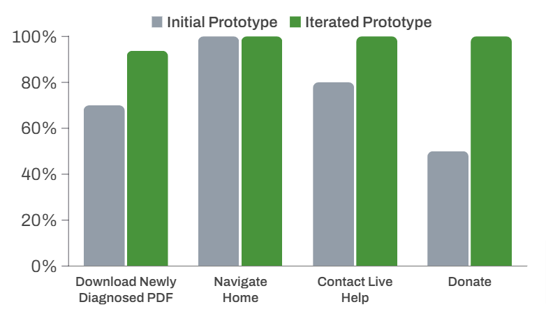
Having tested every iteration of our designs, we were able to improve the success rate of the tasks we gave users from an average of 74% up to an average of 98% total task completion. With a 24% overall improvement, we were glad that our revised navigational structure had a great effect.
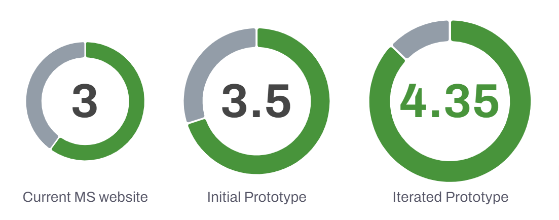
With the navigational structure improved, we wanted to get a feel for how the enhanced imagery was helping to create a deeper emotional connection with the users. We asked users, "On a scale of 1-5 how emotionally comforted or supported do you feel while navigating the website?", with 5 being the most comforted, we increased the comfort level to 87%.
Deliver:
Remedy
Things aren’t always what they seem.
This project was a true lesson in empathy. At every step of the way, we had to empathise with the user not only regarding their digital experience but also to understand their emotional state of mind when approaching the site and how the effects of MS might limit their overall usage of the site. It was very eye opening to have to try to walk in the shoes of our users and feel all of the emotions that they would feel in a situation that can be so difficult to navigate.
Real Users Matter
The one thing that really stood out to me in doing the research and testing for this site was that the real user of the site is crucial. Due to our time constraints and limitations, we spent most of our time researching and testing with users that we were able to connect with, none of which had first hand experience coping with an MS diagnosis of their own or that of a friend/family member. With the research indicating that this was the primary user of the site, being able to get their input on how to make the experience better would have made the world of a difference.
Scaling for the Future
Although we aimed to fix specific issues in the development of the design system, I believe that the next steps for us would have been to further test the usage of the components that we built and create better use cases and parameters so that they were adding the correct value to our design language.
Going the Extra Mile
We were limited with our resources, so we spent most of our time focusing on the homepage and select page experiences, which we believe made a real impact on bringing the “journey” aspect into play. I think given more time and resources, it would have been great to further explore how we could integrate the navigational style into other aspects of the site to help round out our vision of creating a more comforting and supportive experience.

