Terra Travel App
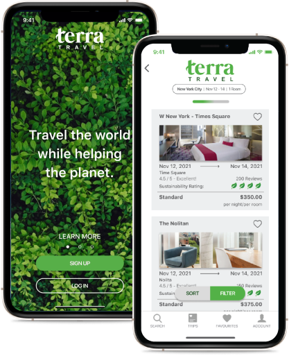
Travellers have a hard time making eco-friendly decisions while booking their trips. The Terra Travel App brings Sustainability to the forefront of the users' experience allowing them to lower their overall eco impact.
Role
Product Designer : User Research, Design, Prototyping and Testing
Scope
Conceptual App Development:
End to End UX Design - 5 Weeks
Discover:
Preparing the Soil
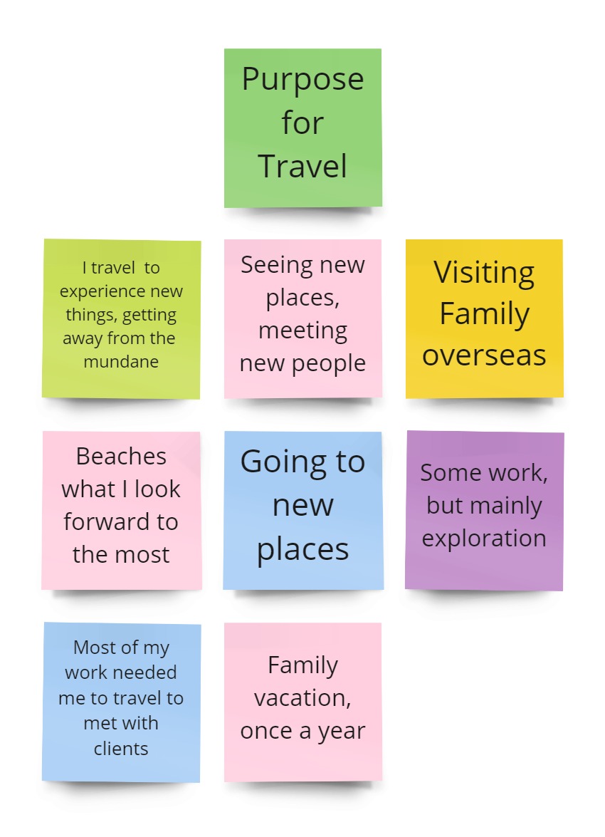
Challenged with creating a travel app for post pandemic travel was quite the task - the most important challenge was to fully understand the user’s wants and needs and to not conflate them with our own. What are they looking for? What do they expect to see from an app for post pandemic travel? In the initial phase of the app development we started gathering research to better understand what users enjoyed about travel pre-pandemic, how they used to go about booking travel and what, if anything, they thought would be different post pandemic.
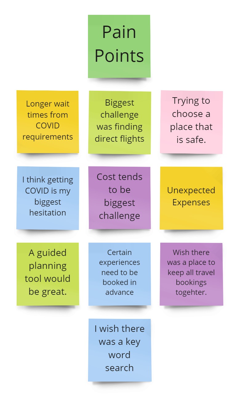
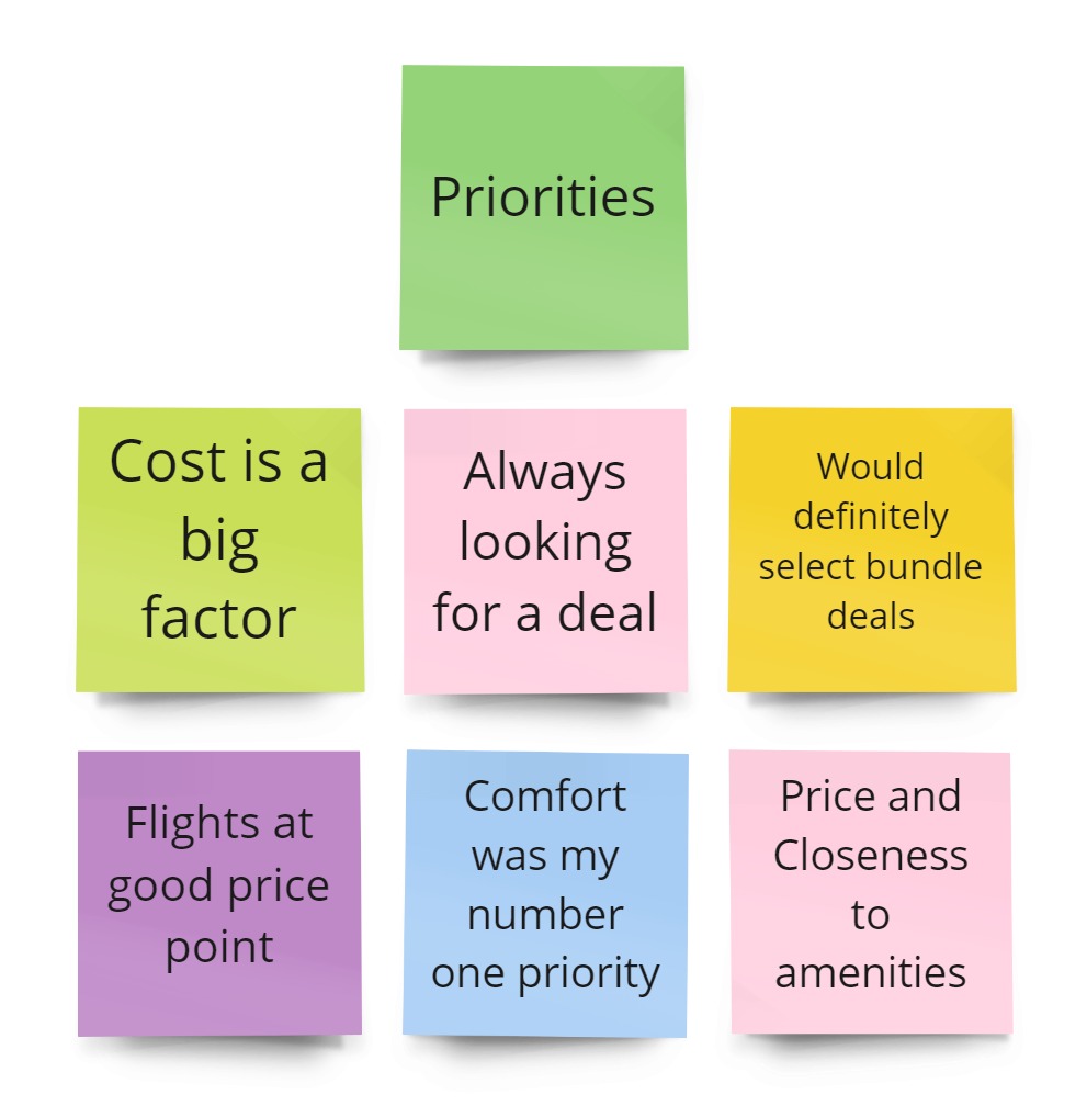
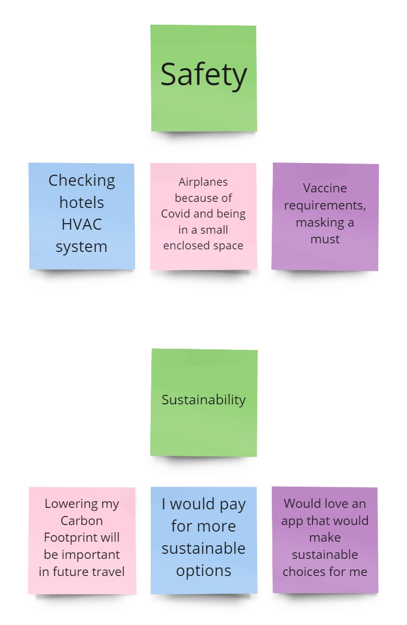
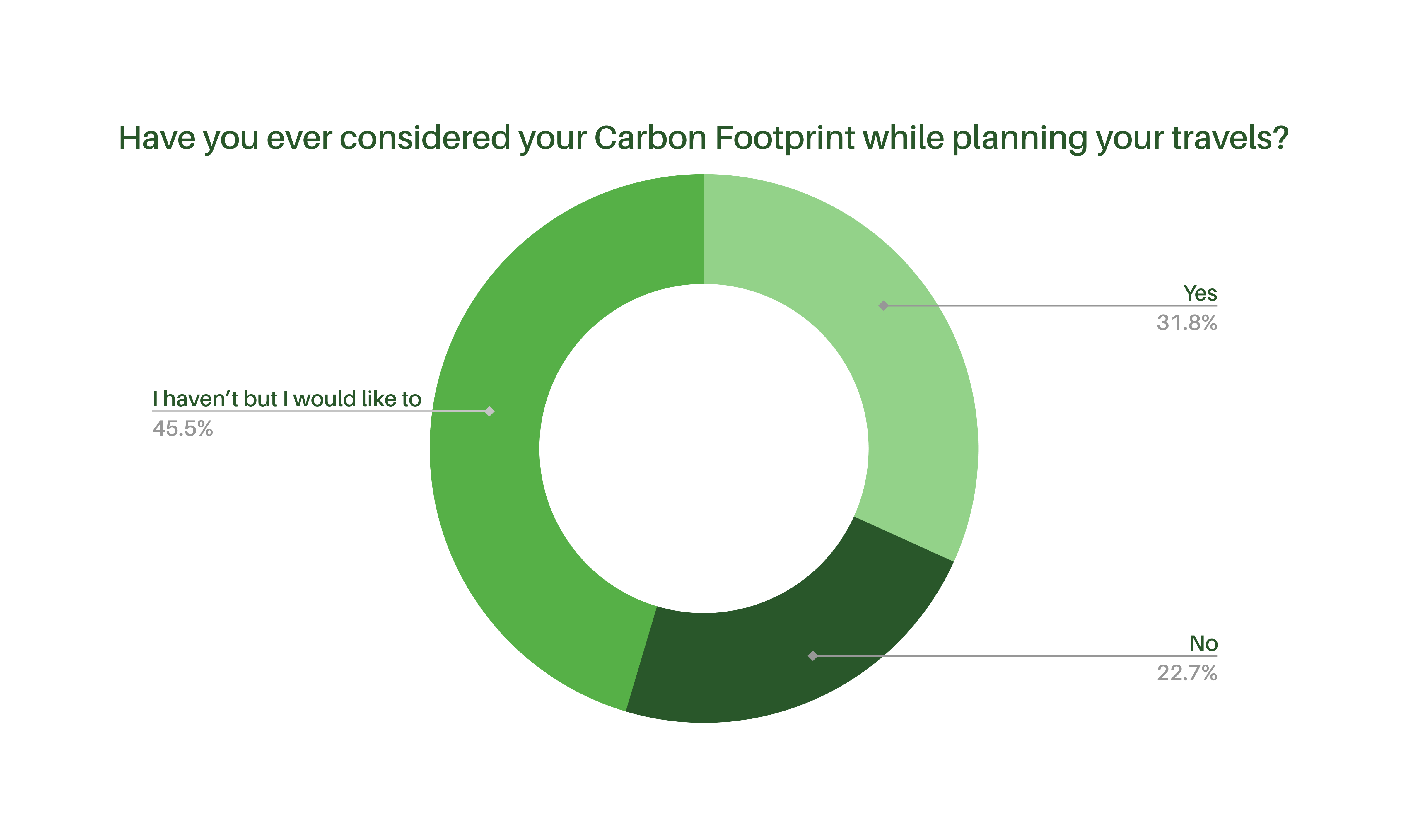
By conducting User Interviews and collecting quantitative data through a survey, I came to understand that although safety (especially health and personal) as well as financial limitations were of big concerns to users, there was one area of interest that wasn’t really being addressed by many other apps or resources.
After surveying 22 people, some common themes started to emerge - sustainability.
In further researching the subject of sustainability when it comes to travel, we came across a Bloomberg article citing a study done by Booking.com which found that -
“Some 83% of 29,000 respondents said they found sustainable travel to be vital, with 61% noting that the pandemic has increased their interest in travelling sustainably.”
Julia Eskins - Bloomberg.com
Sustainability is becoming a part of our vocabulary and expectation of brands but little was being done in the travel space, which gave way for terra Travel.
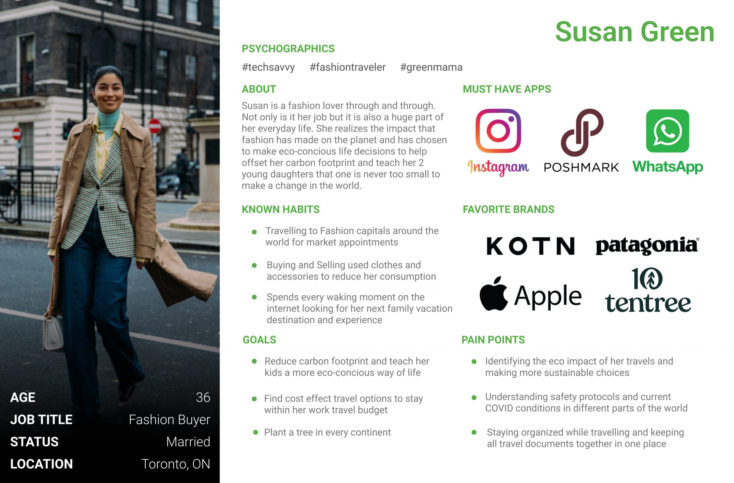
Our User Persona helped us identify who would need our app and how it can help.
Define:
Planting the Seed
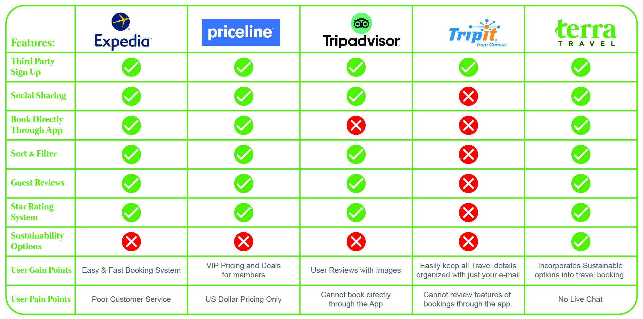
Set out to understand how to best address these concerns while building a unique app, we conducted a Brainstorming session as well as a Competitor Analysis to better understand how current applications were addressing traditional travel booking procedures and to see where there was room for improvement.
Our Competitor Analysis helped identify where our opportunities were in the market.
Feature Discovery:
After sorting through all of the brainstorming ideas and current features from other apps, that were addressing other key concerns regarding post pandemic travel (safety, vaccine mandates, quarantine requirements), we were able to narrow down the 2 unique features that would help set the terra Travel app apart from the rest.

Carbon Footprint Calculator:
This feature would help indicate the overall impact of your trip allowing you to make other travel choices if you choose to reduce your carbon footprint.

Green Leaf Identifier:
This feature would rate accommodations based on their level of sustainability (authenticated by on-site audits conducted by globally recognized and reputable agencies).
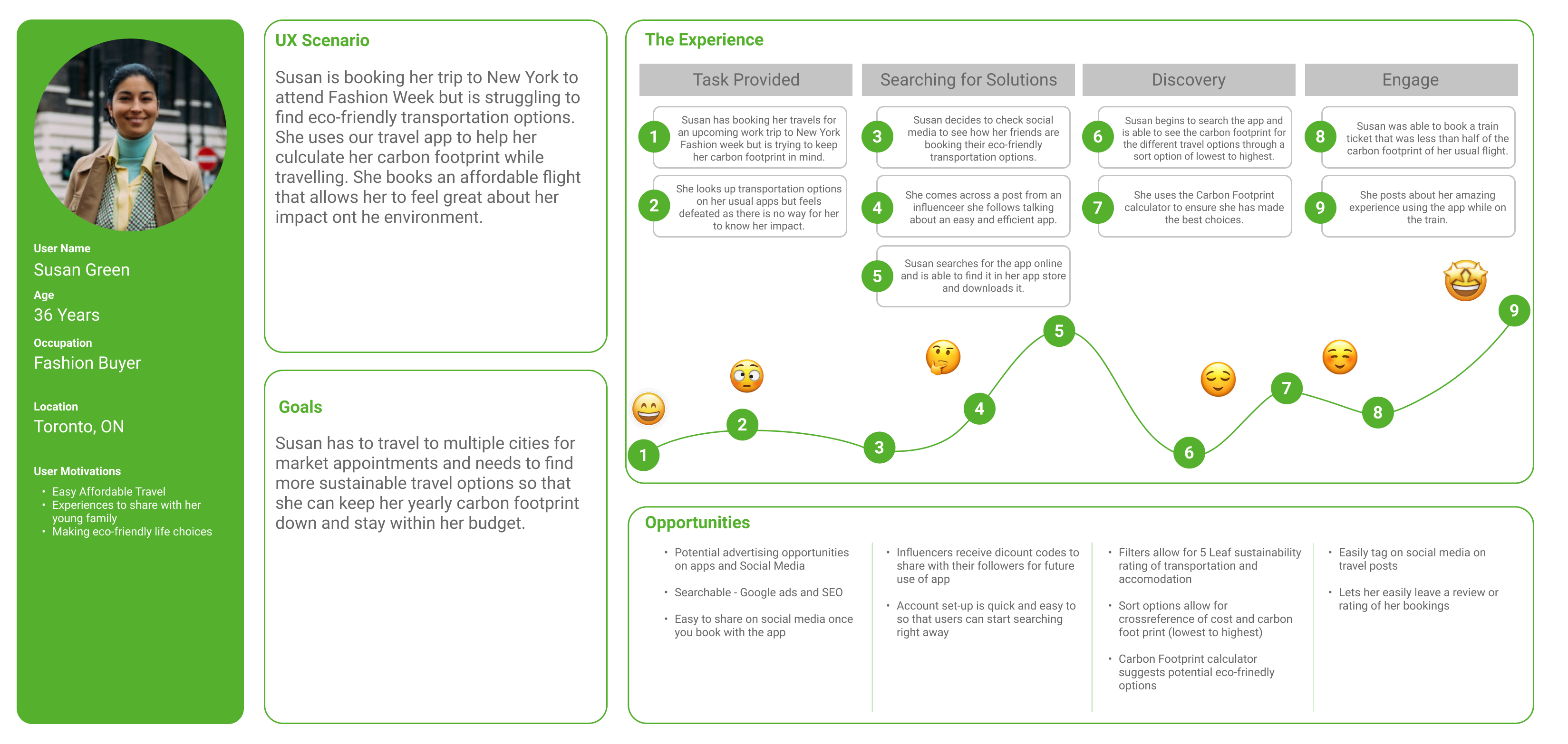
To have a better understanding of how terra Travel would serve the needs of our users, we put ourselves in their shoes and started imagining how our app and its new features could help alleviate some of the stress of travel planning, especially with all of the new concerns around traveling while Covid is prevalent, while allowing our users to make quick and easy choices that would help reduce their overall carbon footprint.
User Journey Map depicting the road that our users take to book their travel and how Terra Travel can help alleviate some frustrations and help them make better eco-friendly decisions.
Develop:
Watering the Plant
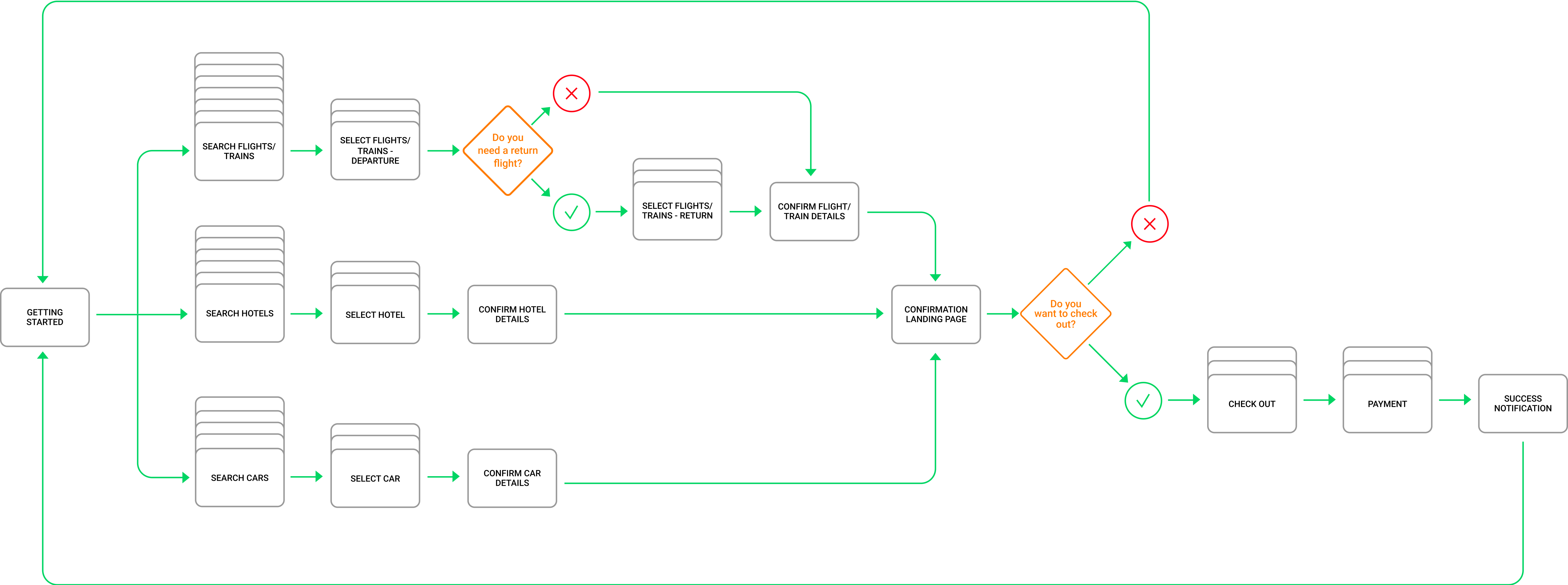
After getting a better understanding of the standards set by our competitors, we formulated our user flow to build the roadmap of our paths and begin imagining the layout of how the trip booking process would look like for the Terra Travel app and how our new features would be implemented into this flow to seamlessly integrated eco sustainable solutions into travelling.
User Flow outlining the Travel booking process for terra Travel.
Once the blueprints were set, it was much easier to start creating the wireframes that would help visualize our unique experience for the user and to make sure that all key features were thought out and well placed, or so we thought.
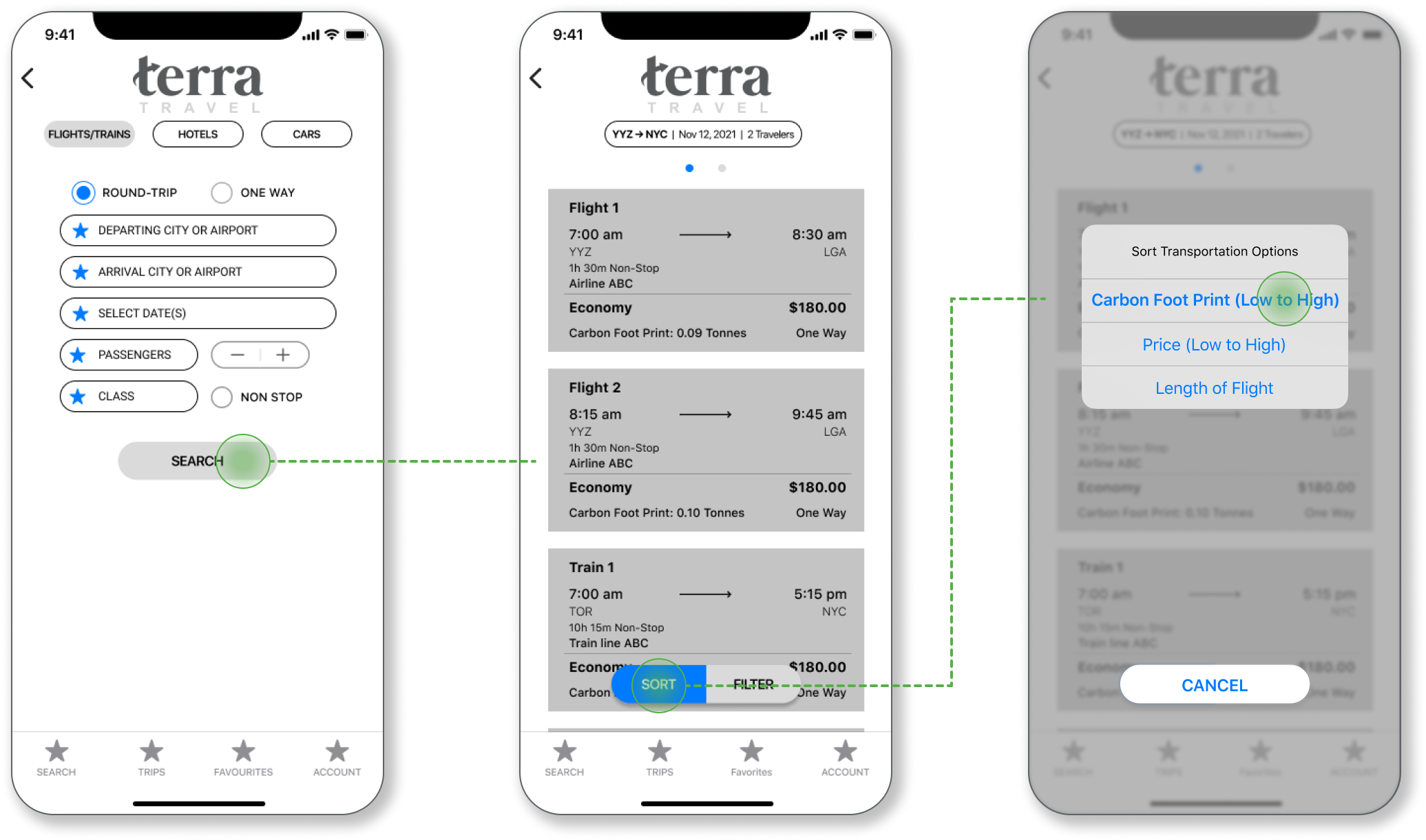
Carbon Footprint Sorting:
In designing the Carbon Footprint I dentifier, we leveraged the traditional travel booking set-ups and designs to eleminate any distraction of other features to help the user focus on our unique feature that allows you to sort transportation by their overall Carbon Footprint impact.
Wireframes showcasing the user flow of the Carbon Footprint Sort Filter feature.
Green Leaf Rating:
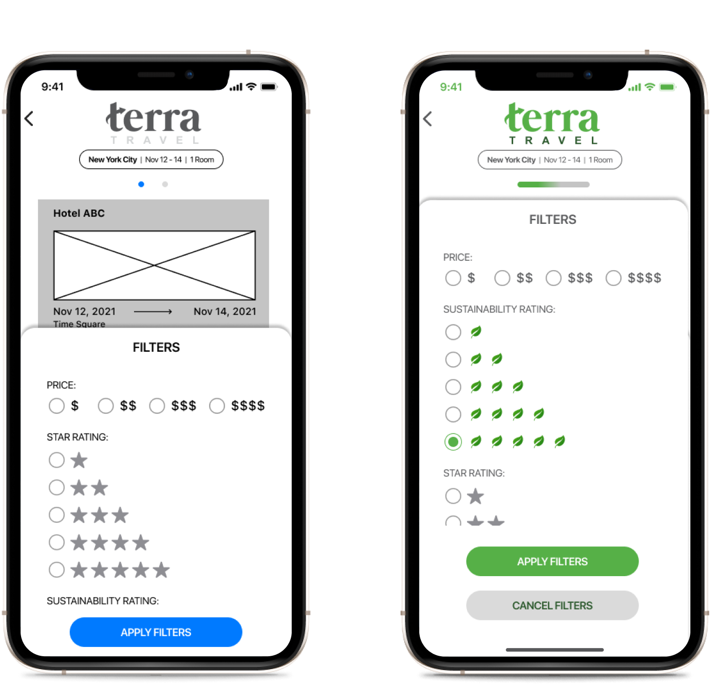
In designing the Green Leaf Rating filter, we leveraged the familiar Star Rating system from most user review ratings and leaned on that mental model to leverage our unique feature that allows you to accomodations by their individual Green Leaf Rating.
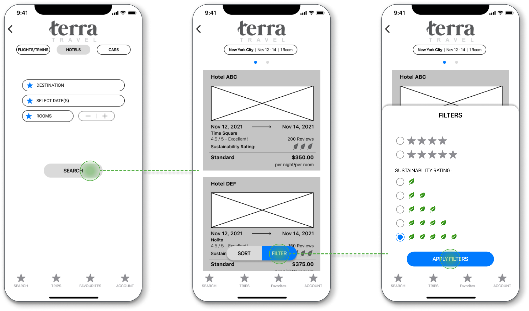
Wireframes showcasing the user flow of the Green Leaf Rating Filter feature.
Testing Plan:
Then came the moment that truly opened my eyes - Usability testing. After carefully crafting a plan to outline our goals, we established 5 tasks that were focused on making easy and efficient travel decisions while helping users reduce their carbon footprint. We set out to check if our design decisions were serving the needs and wants of our users.
Objectives:
1. Are Users interested in coaching screens to help them learn about our features?
2. Can Users book transportation while having a goal for reducing their Carbon Footprint?
3. Can users book a hotel based on our unique 5 Leaf Sustainability Rating identifier?
Tasks:
1. Create an Account
2. Search for a One way ticket to New York
3. Book transportation with the lowest Carbon Footprint
4. Search for Hotels in New York
5. Book Hotel with 5 Leaf Sustainability Rating
The results were in...
We quickly came to realize that some decisions, mostly ones based on common mental models, like the overall onboarding process with ability to connect with other existing accounts, were inherently easier for users to complete but when it came to the new features we had developed, users had a lot of feedback of what their expectations were of the design and how it communicated the information that they were hoping to gather.


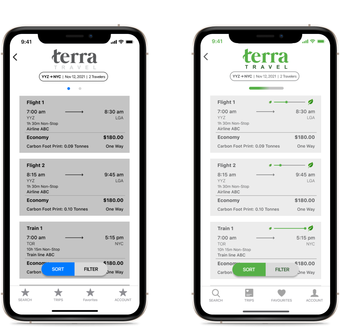
After collecting valuable feedback from our testing and prioritizing things that were of most importance to both our user’s as well as terra Travel, we set out to make my initial round of iterations.
Design, Test, Repeat
Our overall success rate with our usability tests were great, with users being able to complete all of the tasks with a 100% success rate. There were definitely some areas that needed futher clarity to make the overall learning experience of using the Terra Travel app a bit smoother.
Deliver:
Watch it Grow
This project was extremely exciting as it was my first UX Case Study. I really enjoyed getting to learn the process of listening and learning from the users and helping to find a way to solve their problems.
People Really Do Care
I was pleased to see, through our user interviews and the survey, that the large majority of people have an interest in their eco impact and incorporating better practices into their life. After having conducted usability testing, I received an overwhelming amount of feedback and support for the app concept as people expressed a genuine interest in adapting more sustainable practices while traveling.
There’s Work To Do
As we identified in the interviews and survey, travelers lead their decision making process with Pricing in mind and I think that I missed the chance to address that in the Wireframes and Prototypes. I would like to go back and find unique ways to implement a system that allows users a way to not have to give up their price consciousness for their sustainability goals and vice versa while still facilitating an experience that makes people feel safe and re-invigorated to travel post pandemic.
